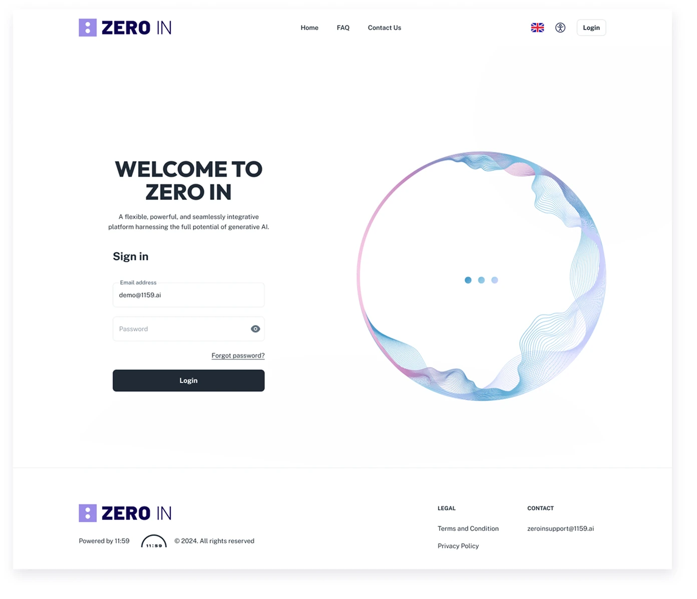
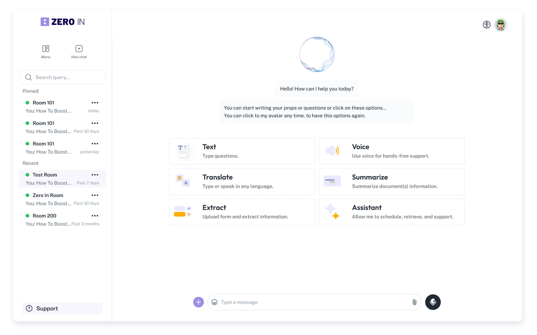
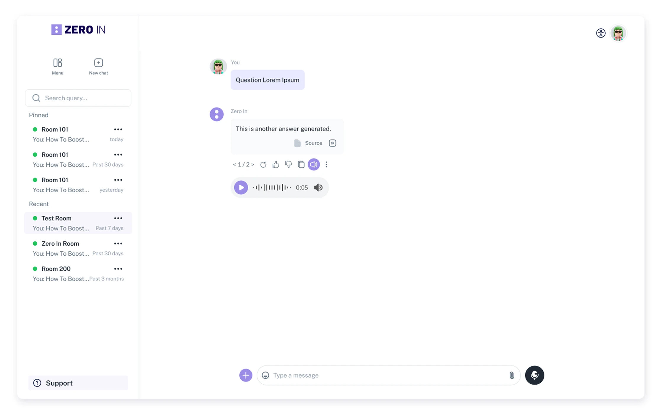
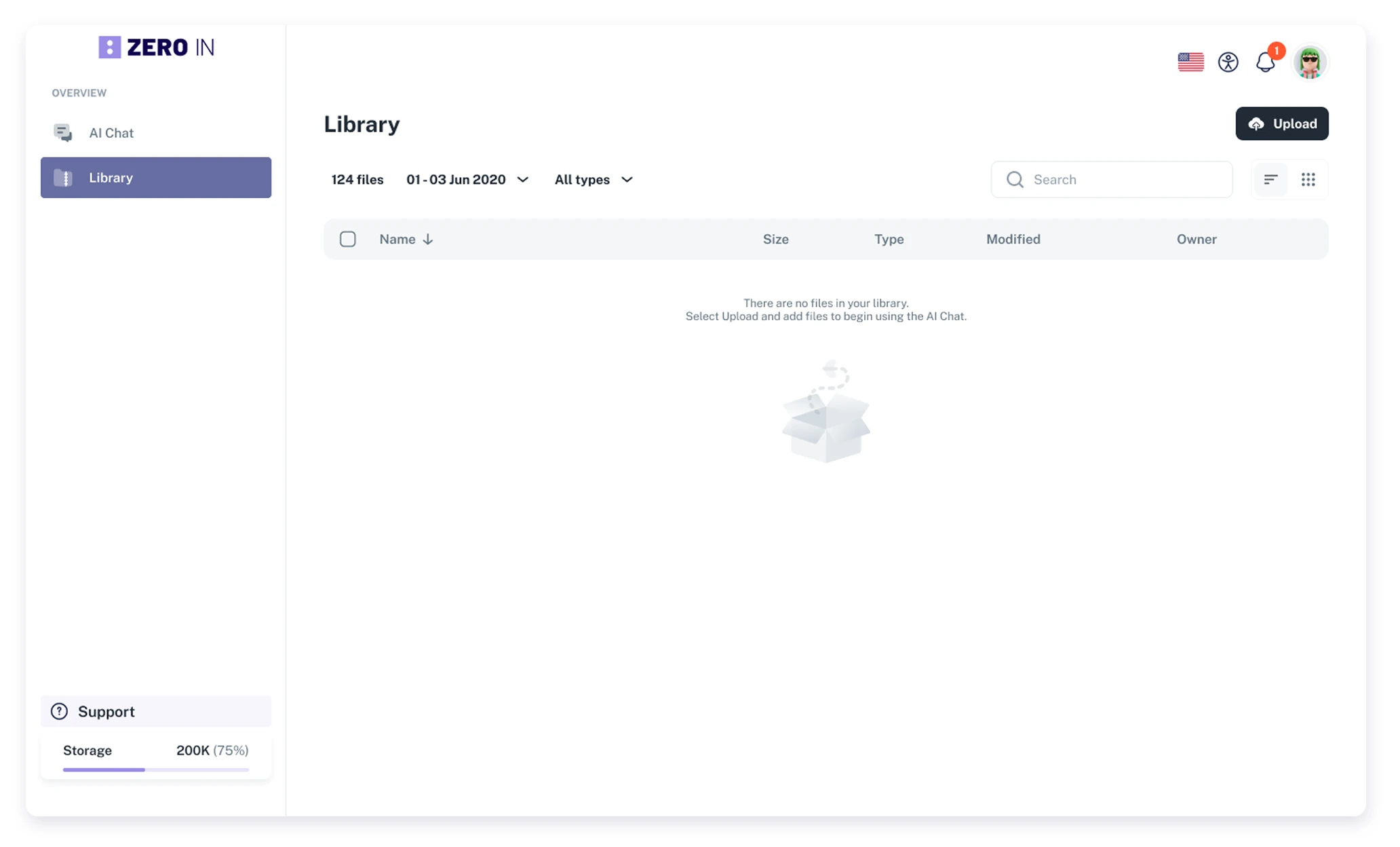
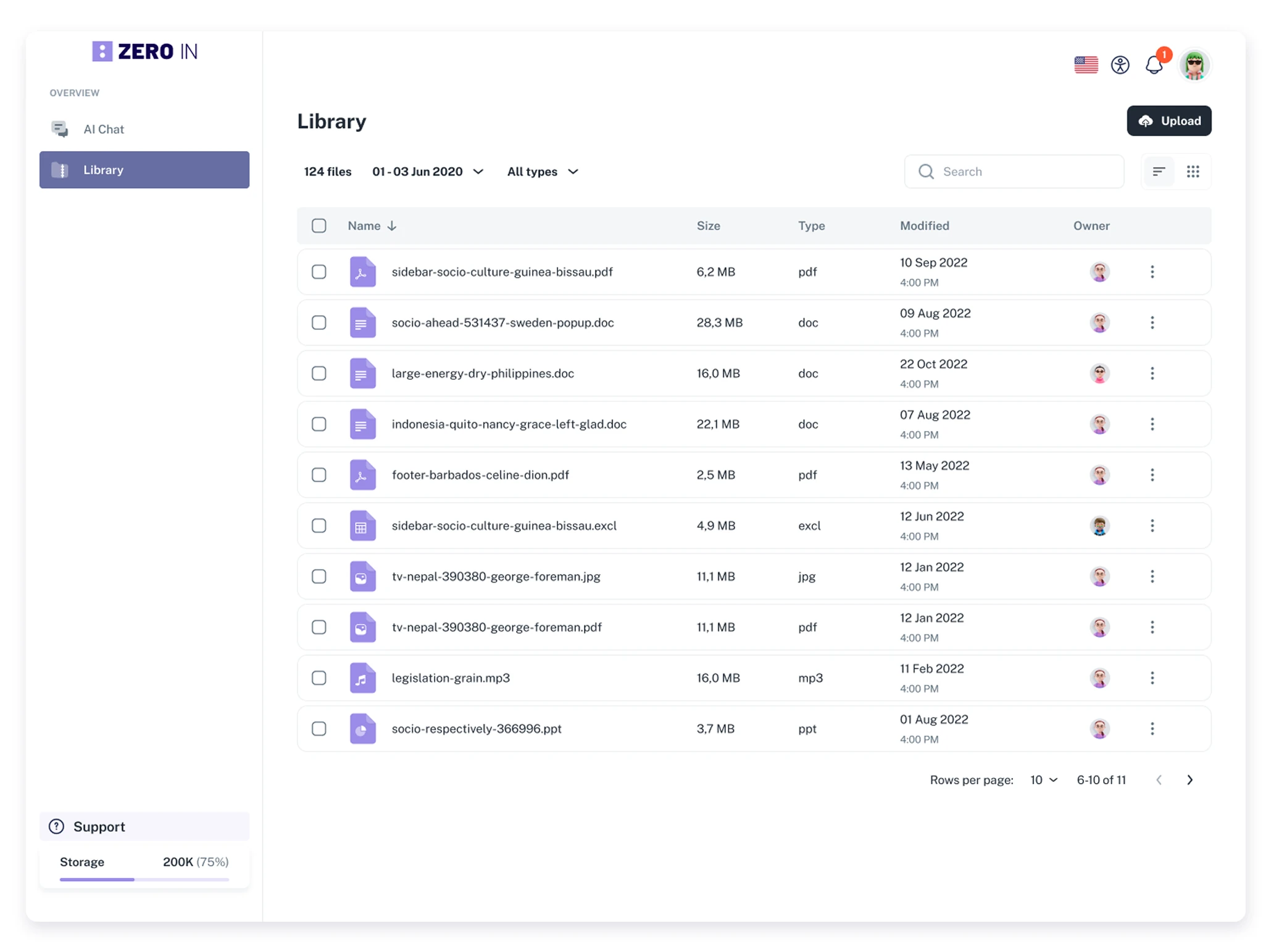
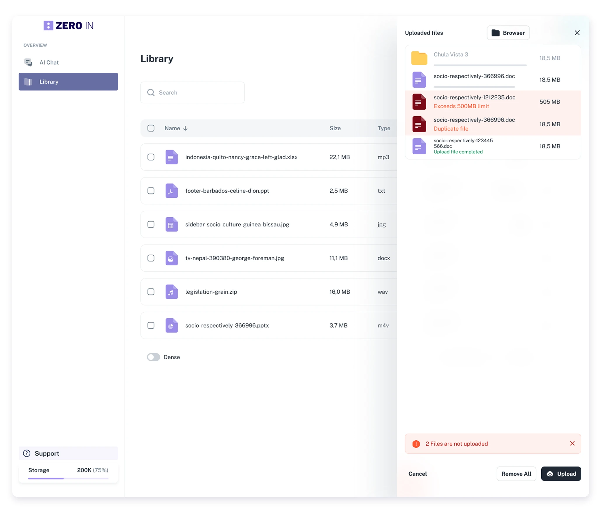
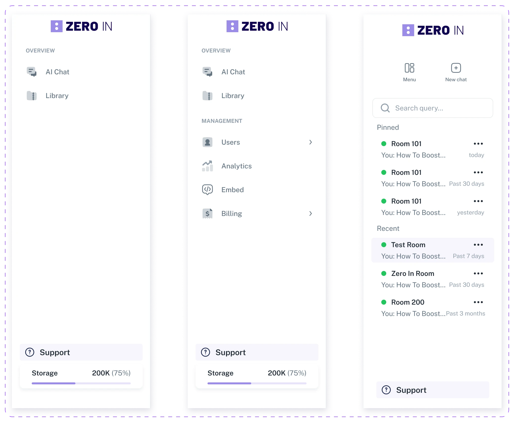
Zero In is an advanced AI assistant designed for organizations and individuals who require full control over their data. Unlike traditional AI models, Zero In ensures privacy by allowing users to manage, restrict, and customize data processing according to their needs. With a minimalist yet powerful interface, it delivers smart, efficient responses while maintaining strict data governance. Perfect for businesses, research institutions, and privacy-conscious users, Zero In combines the intelligence of ChatGPT with complete data autonomy.


